Context
Insight
Moodscope is an online platform that aims to improve users' well-being through the use of a daily mood tracker. Alongside this mood tracker, the platform offers a wealth of resources and community sharing, boasting over 30,000 users.
The visual identity of Moodscope hadn't changed since 2012, and owners felt the platform needed modernising, allowing them the opportunity to engage with a younger audience and improve their growth rate.

The brief
Getting started
Moodscope reached out and initially requested an independent assessment of their current position, and a strategy for improvement. Following the assessment, DH was then asked to completely overhaul their visual identity and platform, better reflecting their brand.
Moodscope also made the decision to change their pricing model, moving away from completely free options and instead offering temporary free trials. A vast improvement of the site was the main justification of this to users.


Brand
Brand identity
The visual representation of Moodscope needed to more strongly reflect their brand and positioning. They're approach to improving mental well-being is backed by science, but their execution lacked consistency, accessibility, and style.
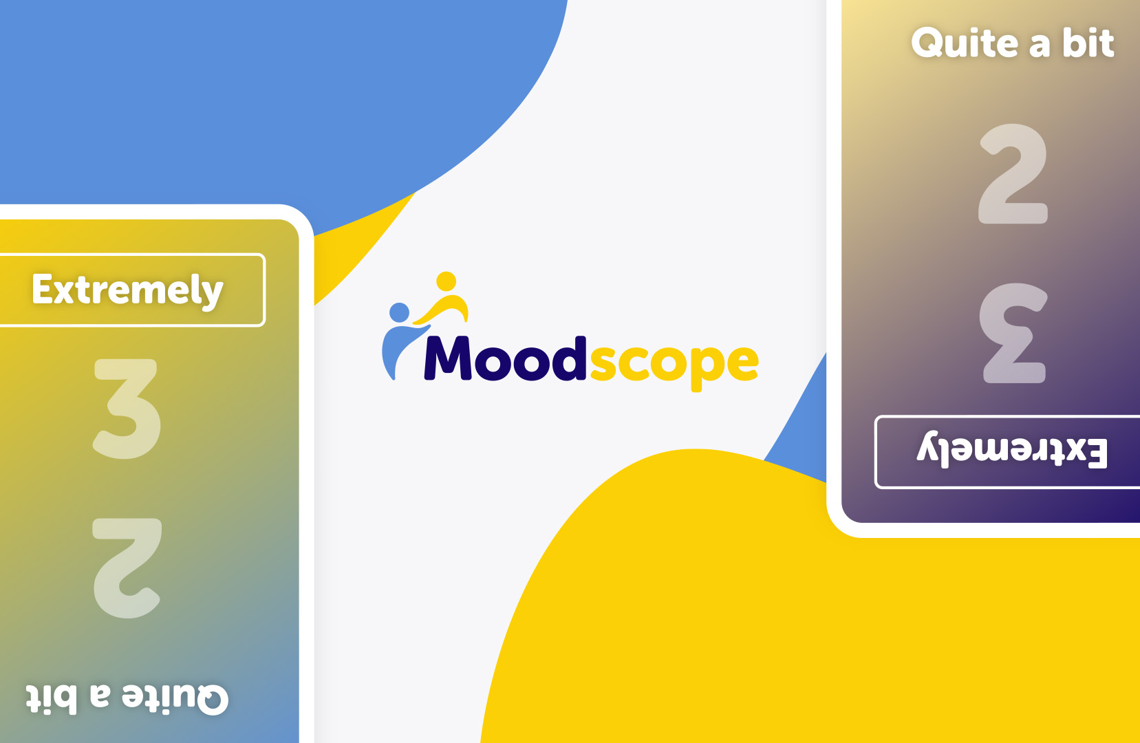
The brand identity needed to show a balance between positivity and negativity, with a strong human support element. So much of Moodscope’s success is based around their community of members, supporting one another through the ups and the downs. It was also key to demonstrate a progression or improvement in mood, which is why there is an upward flow to the logo design.
A high contrasting colour palette denoted the polar opposites of positive and negative, while the abstract figures of the logo icon represent the human, supportive group of users.

Web
The platform
The web platform was a significant undertaking, with many complex, core features, all offered to Moodscope members through a monthly subscription service. The weakest aspect of the previous version of the platform was the design - it has not been updated in over 12 years, and it was in need of drastic modernisation. It was clear that a complete overhaul would provide better functionality, flexibility, and style.
With a well defined brand identity and web design, the development of every page and feature took place. This included Moodscope’s USP - their daily mood card test and chart trackers.


Results
Impact
Moodscope are very happy with their new brand identity and platform. After launch they have been able to scale their number of subscriptions, and are now much more confident about advertising themselves on social media and other channels.
62% increase in monthly recurring revenue
43% increase in paying users
87% reduction in monthly platform overheads
Related Work

